Scatter plots are remarkable tools in the field of statistics and data analysis and offer insightful views into the relationship between variables. Offering valuable correlations, they are one of the mainstays of mathematic data representation. Yet, scatter plots remain a largely misunderstood tool in the big data era. Navigating this critical landscape requires delving deeper into the fundamentals of scatter plots, their applications across various fields, and the common pitfalls and misconceptions around them. Keep reading to learn more about these remarkable visual tools.
An Introduction to Scatter Plots

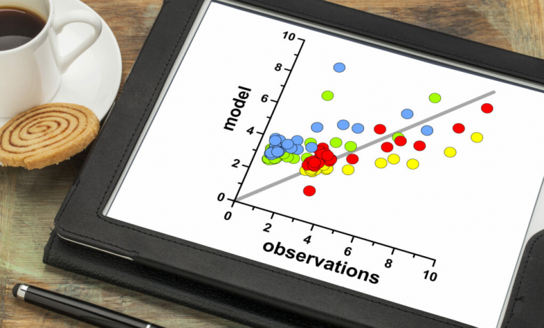
Scatter plots, often referred to as scatter diagrams or scatter graphs, are visual representations of the relationship and correlation between two numeric variables. Each point on the plane represents a single data point that corresponds to the values of two variables. They provide an intuitive and effective way of interpreting and illustrating numerical data, thereby playing a vital role in statistical analysis and predictive modeling.
The ability of scatter plots to showcase correlations effectively is what sets them apart from other plotting techniques. This is particularly useful for identifying trends, spotting outliers, or unearthing potential problem areas that require further investigation. With the use of scatter plots, complex data can be broken down and analyzed in a simplistic yet comprehensive manner.
Scatter charts become even more valuable when dealing with large amounts of big data. These graphical representations can be used in a broad spectrum of fields, ranging from healthcare to finance, and are not constrained by the complexity or amount of data. As long as there are numerical data points that can be plotted on a two-dimensional plane, scatter plots can be used.
The Core Components of Scatter Plots
Scatter plots typically consist of two axes— horizontal (x-axis) and vertical (y-axis), which represent the two numerical variables that are being evaluated. Each point on the plot corresponds to pairings of numerical values from the two data sets. These points do not connect, hence giving the plot its scattered appearance.
The positioning of the points is where the critical insight resides. The closer proximity of points to each other indicates a stronger correlation between variables, while scattered points suggest a weak correlation. Positive slopes indicate a positive correlation; as one variable increases, the other does too. Conversely, negative slopes point towards an inverse relationship; as one variable increases, the other decreases.
Besides the x and y axes, scatter plots may also include a line of best fit or a regression line. This line serves as a prediction of the trend in data, showing how changes in one variable impact the other. However, it’s important to understand that this line does not necessarily signify a causal relationship between the variables; rather, it indicates a statistical correlation.
Scatter Plots in Practice

The versatility of scatter plots allows their application across a multitude of contexts. In business, scatter plots can reveal trends and influence data-informed decisions. They can detect patterns in customer behavior for segmentation, illustrate sales and revenue progress, or even examine the relationship between staffing levels and output productivity.
In the field of healthcare and life sciences, scatter plots can identify the correlation between variables such as age and certain health indicators, like blood pressure or cholesterol levels. This aids in predicting potential health risks and designing effective prevention strategies.
In the realm of education and research, scatter plots are invaluable for visualizing patterns and trends in data. They can help educators identify relationships between variables such as study hours and academic performance, fostering targeted interventions and improved learning strategies.
Overall, it’s clear that scatter plots are a reliable data visualization tool for anyone interested in interpreting data. While they may appear straightforward on the surface, a deep understanding of their fundamentals, applications, and limitations can enhance an individual’s ability to draw meaningful insights from data. So whether you’re a student, a researcher, a business analyst, or simply a lifelong learner, understanding scatter plots could well be a transformative step in your data journey.